


The Ryder Cup: A Style Disaster We Can’t Help but Love
Ah, the Ryder Cup! It’s one of those events in golf that makes our hearts race. Every two years, this epic showdown lasts just three days, but it sticks in the minds of golf lovers for years—maybe even decades. There’s just something magical about it, right? From the nail-biting matches to the camaraderie, it’s a spectacle like no other. But let’s not forget about one of the most entertaining aspects: the team uniforms.
A Fashion Playground
Now, let’s be honest—when it comes to pro golfers, their fashion choices are usually pretty safe. Where are the bold styles? Sure, we have Jason Day and Tony Finau who occasionally step out of the box, but they’re the exceptions. The Ryder Cup, however, throws caution to the wind. Historical team uniforms can vary from elegantly classy to downright cringe-worthy.
The Good Old Days of Ryder Cup Style
Interestingly, if you look back at the early years of the Ryder Cup, the outfits were generally quite classy. There wasn’t much to poke fun at, and everyone looked pretty sharp! But then, around the mid-80s to 2014, the fashion choices took a wild turn. Sadly, this is where all the good material for roasting comes in. If you think I’m lying, stick around as we dive deep into the cringiest outfits in Ryder Cup history.
Uninspired Recent Years
Fast forward to the last decade, and the uniforms have generally been… well, kind of boring. Teams seem to be playing it safe, relying heavily on traditional color schemes. Creativity? Nah, not really. You’d think in a competitive event like this, they’d want to make a statement. But it seems "meh" has become the new "wow." I mean, who doesn’t love to have some fun with their outfit during such an intense competition?
Our Top 10 Style Catastrophes
Alright, enough of the chit-chat! Let’s get into the meat of the matter—my picks for the top 10 worst Ryder Cup uniforms ever worn. Spoiler alert: some of these are so bad they’re almost good.
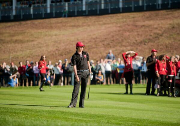
10. 2010 U.S. Team
First up, we have the 2010 U.S. team, who chose to channel their inner Texas Tech. Within this ensemble, we found black shirts with matching pants, black shoes, and a dreadful red hat. Add a belt that screams "I’m trying too hard," and you have a complete disaster on your hands. This was during a strange time when American teams avoided red, white, and blue. Thankfully, they eventually figured out that sometimes, classic just works!
9. 2014 Team Europe
Next on our list is the 2014 Team Europe. Now, I’m all for a pop of purple, but this dark light purple combinarama is something else altogether. It had a weird tattoo design to top off the aesthetic, and let’s just say that asymmetrical patterns aren’t for everyone. They were really vibing with that theme, but it didn’t quite hit the mark.
8. 1995 U.S. Team
Then we move back to 1995. Picture this: the U.S. team rolls out in outfits that look suspiciously like picnic table covers. It’s almost as if they decided, “Let’s dress like we’re on a family outing!” While they at least incorporated some red, white, and blue, the pattern struck out hard, especially when combined with navy pants and black shoes.
7. 1993 U.S. Team
Now, can we talk about 1993 for a moment? This squad chose a beige sweater combo that screams “forgotten trophy.” There’s confusion about the motive behind the attire. Why wear these beige layers when the Europeans were rocking bold reds? And they topped it off with more beige suits—yikes!
6. 2012 Team Europe
Flash forward to 2012 where Team Europe made the bold choice of a highlighter lime polo. Why? This isn’t the Tour de France, folks! The awkward placement of “Team Europe” on the chest along with random black accents created a look that left spectators blinking in disbelief.
5. 1989 U.S. Team
Now we journey back to 1989, where the U.S. team donned an overly busy cardigan over a collared shirt that kind of falls flat. Sure, it’s vintage, and I can appreciate the vibe of the late ’80s, but this is not the time nor place for so much clashing. Navy pants with white shoes just can’t make up for the chaos above.
4. 2008 Team Europe
Then we have the 2008 Team Europe ensemble that was half-time flashback from the early 2000s. With a mix of white pants, white hats, and bizarre electric blue shirts, this outfit was an unfortunate echo of fashion choices past. I mean, who thought so many stripes and colors would be a good idea? All of this made my head spin.
3. 2010 U.S. Team (Again)
It’s worth mentioning again—yes, the 2010 U.S. team makes the list for a second time. They opted for a lavender sweater vest that simply doesn’t work. The combo felt like they were trying to serve up a gimmick, but it just fell flat. What were they thinking?
2. 2006 U.S. Team
Now, let’s dig into 2006, where brown seemed to be the go-to color for the U.S. team’s practice rounds. It felt like a nod to the previous European team—but honestly, no one needed to go this route. Brown on brown on brown is just a recipe for a fashion faux pas.
1. 1999 U.S. Team
Finally, we’ve reached the gold standard for bad Ryder Cup attire: the 1999 U.S. team’s maroon shirt with framed pics of past squads. This visual catastrophe is so cringe-worthy, it almost comes around to being good. It’s all about that mismatched beige collar with baggy khaki pants that screams, "Why, oh why?"
Your Thoughts?
So there you have it, folks! From the somewhat laughable to the outright bizarre, these uniforms are grave reminders that golf isn’t just about precision on the course but also about making statements—good or bad. What do you think? Are there other outfits you’d toss into the mix? Let’s chat in the comments below!
The Ryder Cup is a beautiful tradition, and while the style may falter at times, the spirit and excitement of the competition always shine through. Here’s to hoping future teams take risks—because who doesn’t love a little flair in the game we adore?


